
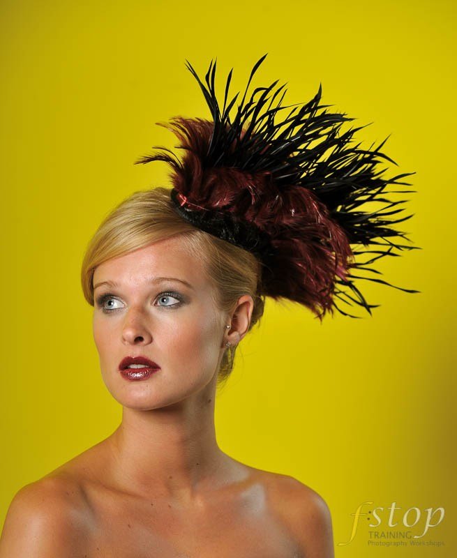
Ok, here is a question. colour or black and white?
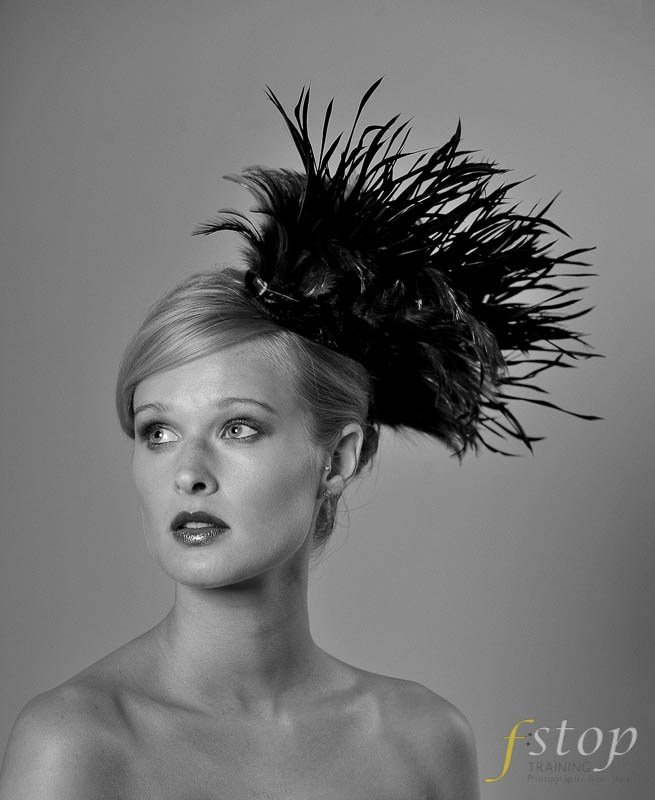
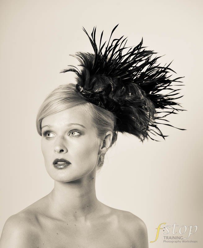
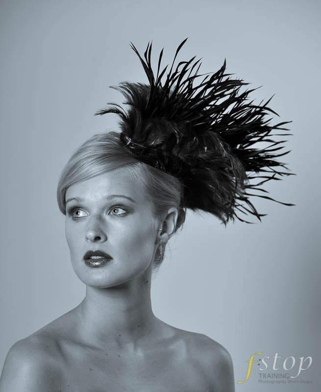
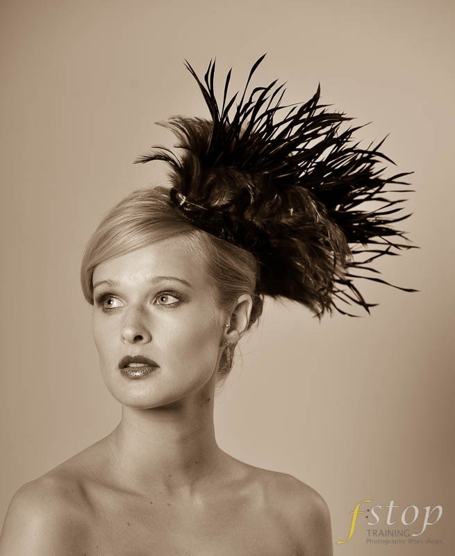
This has got us thinking about images and with the software at out fingertips these days the end result can be rather different from the original image out of the camera. Here we take a look at an image of the stunning Kim. A portrait shot against a bright yellow wall. It’s a rather striking portrait of her and we thought this image would illustrate quite nicely the effects of converting to b&w and while doing so why not add in a couple of toned images for good measure.
There is no definitive right or wrong here, it is down to personal choice and taste at the end of the day. Personally I actually prefer the conversion to mono but I’m a sucker for this at the best of times. Yes everything is shot in glorious technicolour these days but it does not simply end there. Depending on your preferred choice of software there are no limits to what one can do to an image. Here at f:stop training we are great believers in not changing the image too much in either Photoshop or Lightroom instead we opt for subtle changes like here. taking a colour image and converting to mono and adding in a couple of toned images for good measure.
We do not go in for digital manipulation or digital art as some would call it. While it can be quite incredibly good and done well can create amazing work we prefer to shoot what we see and simply give it a tweak here and there. Digital art/ manipulation of images we will cover some other time in a future post, but for now we will stick to the basics.
So here we have one image presented to you in 4 different ways, yes they are the same image and yet they are all different. Which do you prefer and why?


Leave A Comment