
Just about every photo editing software package contains the ability to adjust both the saturation and vibrancy of colours in an image. But, what is the difference between Saturation and Vibrance?
This is a question I get asked a lot during my workshops and classes and to be honest, it’s a difficult answer to put into words. It is always best answered by demonstrating the different look a Saturation and Vibrance adjustment has on the same image. However, let me first try to put it into words.
Saturation
A colour’s saturation can be thought of as how pure or intense it is. In other words, how red are the reds, how blue are the blues etc? It is not a measurement of how bright the colours are. Rather, it’s a measurement of how strong and punchy the colours are. Strange thing is, “vibrant” and “vibrancy” are both synonyms offered by a thesaurus for saturation.
When you adjust the saturation in an image using any photo editing software, the intensity of the colour in every pixel is increased by the same amount. So, if you increased the Saturation by 50%, the colour in every pixel would increase by 50%.
Vibrance
As I mentioned above, the word “vibrant” and “vibrancy” are often used to describe saturation. The two words are often used in the English language to describe the intensity of colour. A distinction between Saturation and Vibrance didn’t exist until Adobe decided that there should be one. In fact, the word “vibrance” doesn’t actually exist (yet) in the English language. Just try typing it into an application with a spell-checker. Speaking of Adobe, here is their definition of the Vibrance control
Vibrance adjusts the saturation so that clipping is minimized as colours approach full saturation. This adjustment increases the saturation of less-saturated colours more than the colours that are already saturated. Vibrance also prevents skin tones from becoming over saturated.
Basically, the Vibrance adjustment can be thought of as a smart form of the Saturation adjustment. It will selectively increase the saturation of colours in an image. Some colours will get more treatment than others. Again, if you increased the Vibrance by 50%, the software will analyse each pixel and determine how much of the 50% increase each individual pixel should get.
This may sound like you, as the photographer, are losing control over the adjustments to your image. To an extent, you may be correct to think this. However, the Saturation adjustment is simply clumsy when compared to the Vibrance adjustment.
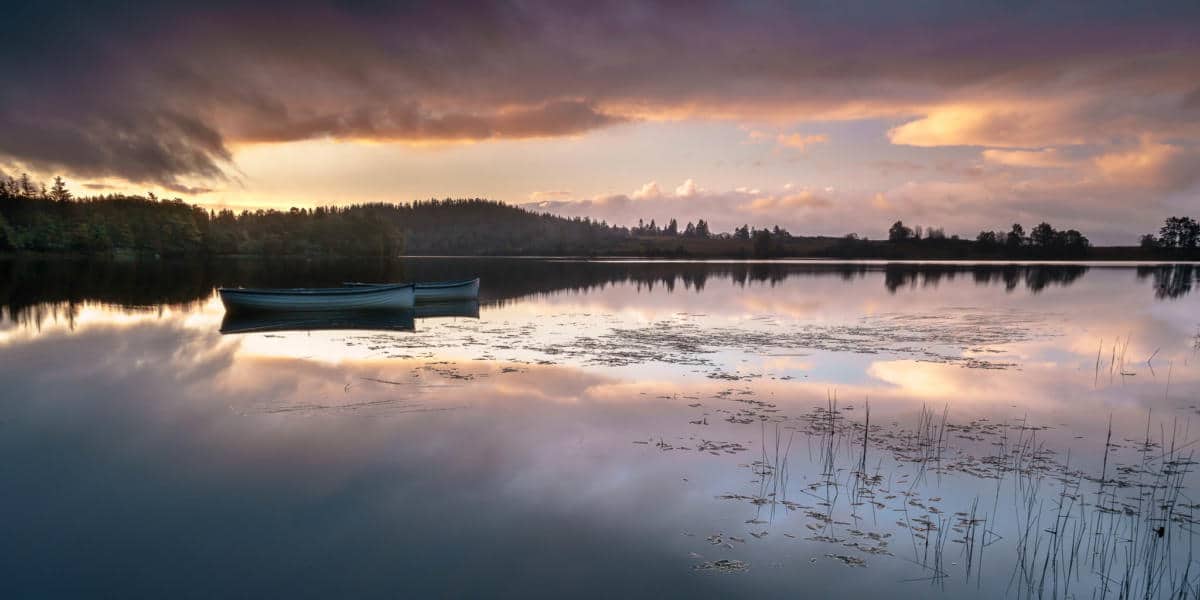
Let me show you. The two versions of the image below have had either the Saturation or the Vibrance increased by 50%.
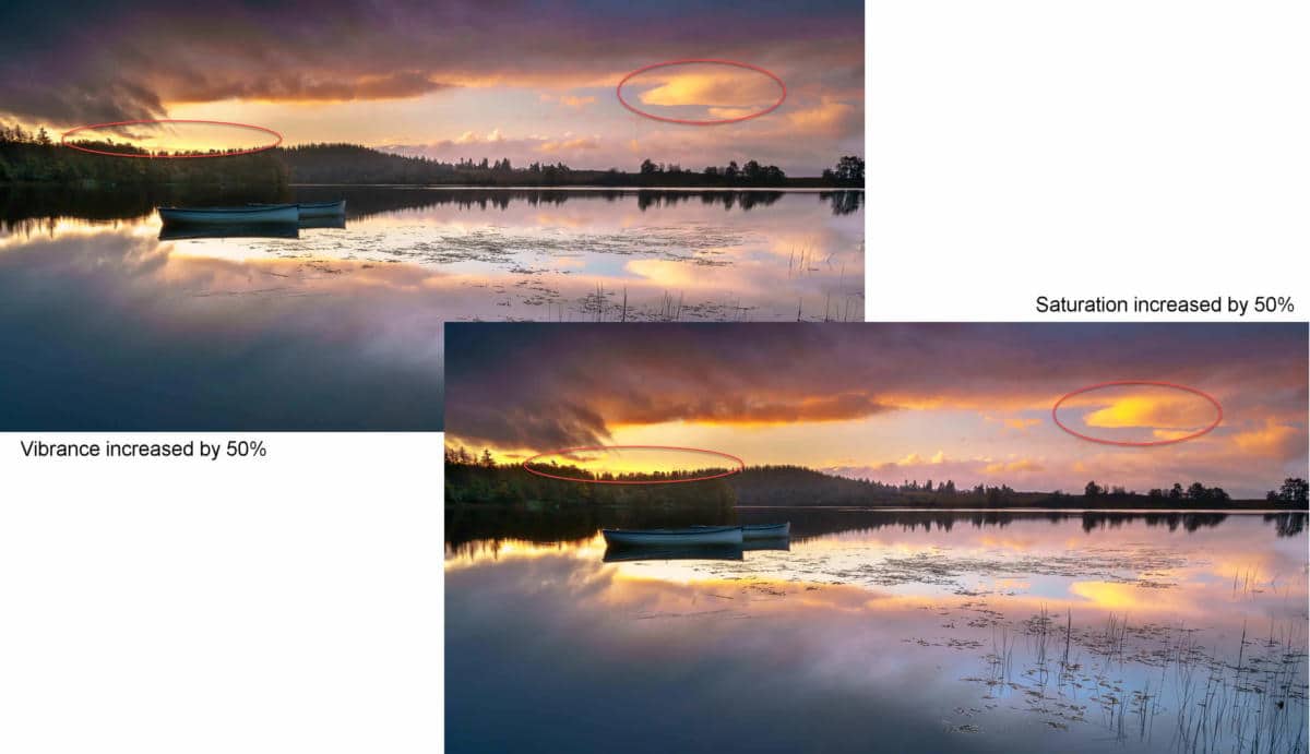
It may be subtle in this low-resolution example but you can see that the already saturated areas of the sky have been protected when the Vibrancy was adjusted. However, the image that has had the Saturation increased now has oversaturated areas. Areas that are oversaturated will have no detail when printed.
Conclusion
To put it simply, the difference between Saturation and Vibrance is, Saturation is not selective but Vibrance is. Saturation will oversaturate areas of your image but Vibrance won’t. So, in my opinion, it’s simple, if you want to increase the colours in your image, use Vibrance by the gallon and if you do use Saturation, just use a drop.


Thanks Martin,sometimes it’s the simplest things that can make a difference.
John